Theme Resources and publication
This page covers the keys an application can consume and how the theme engine updates them. For a first app, begin with Basic Usage.
This page is the supported resource-key reference for Fluence.Wpf. Use it when styling application content or writing a control template. The complete, build-checked key inventory is PublicKeys.txt; the families below explain how to use those keys.
Initialize and consume resources
Call ApplicationThemeManager.Apply before showing the first window. It creates a resource dictionary with colors and brushes, then loads typography and control templates. Theme and accent updates replace the computed dictionary, so use DynamicResource for live values:
<Border Background="{DynamicResource CardBackgroundFillColorDefaultBrush}"
        BorderBrush="{DynamicResource CardStrokeColorDefaultBrush}"
        CornerRadius="{DynamicResource OverlayCornerRadius}" />
Each published color normally has a frozen SolidColorBrush sibling with Brush appended. Use the brush key for brush properties. Some special brush keys have no color sibling, and a few accent brushes intentionally differ from the same-named color's direct conversion. Consult the frozen inventory for exact spelling.
When a visible, realized FluenceWindow changes between Light and Dark, changes accent, or changes its backdrop request, its previous WPF surface fades away over the new appearance for 167 ms. Theme and accent resources, manager state, and public change events update immediately; the fade is a temporary visual overlay, not interpolated brushes. Windows draws native DWM backdrops outside WPF, so those pixels do not interpolate. High Contrast entry or exit is immediate for accessibility. The fade is skipped when motion is disabled or a usable snapshot cannot be captured. Ordinary WPF Window instances update immediately.
Supported key families
| Family | Examples | Use |
|---|---|---|
| Text | TextFillColorPrimaryBrush, TextFillColorSecondaryBrush, TextOnAccentFillColorPrimaryBrush, AccentTextFillColorPrimaryBrush | Body text, secondary text, text on accent, and accent text |
| Controls | ControlFillColorDefaultBrush, ControlFillColorSecondaryBrush, ControlFillColorInputActiveBrush, ControlFillColorDisabledBrush | Control surfaces in normal and active states |
| Alternate and subtle fills | ControlAltFillColorSecondaryBrush, ControlAltFillColorTertiaryBrush, SubtleFillColorSecondaryBrush | Tracks, passive fills, and low emphasis states |
| Accent fills | AccentFillColorDefaultBrush, AccentFillColorSecondaryBrush, AccentFillColorTertiaryBrush, AccentFillColorDisabledBrush | Primary actions and selected states |
| Strokes and focus | ControlStrokeColorDefaultBrush, ControlStrongStrokeColorDefaultBrush, CardStrokeColorDefaultBrush, SurfaceStrokeColorDefaultBrush, DividerStrokeColorDefaultBrush, FocusStrokeColorOuterBrush, FocusStrokeColorInnerBrush | Edges, dividers, and focus visuals |
| Background and layers | ApplicationBackgroundBrush, SolidBackgroundFillColorBaseBrush, LayerFillColorDefaultBrush, CardBackgroundFillColorDefaultBrush | Page, layer, and card surfaces |
| Status | SystemFillColorSuccessBrush, SystemFillColorCautionBrush, SystemFillColorCriticalBrush, SystemFillColorAttentionBrush, SystemFillColorNeutralBrush | Feedback and severity surfaces |
| Accent ramp | SystemAccentColor, SystemAccentColorLight1 through Light3, SystemAccentColorDark1 through Dark3 | Raw Windows or custom accent ramp |
| Theme-resolved accent | SystemAccentColorPrimary, SystemAccentColorSecondary, SystemAccentColorTertiary, and brush variants | Accent roles selected for the resolved theme |
| Chrome | TitleBarActiveColor, TitleBarInactiveColor, WindowBorderColor, and brush variants | WPF window frame |
The named families contain more keys than the examples shown. The public inventory also includes the ControlOnImageFillColor*, LayerOnMicaBaseAltFillColor*, acrylic, card, background, and InfoBadge foreground families. AcrylicBackgroundFillColorDefaultBrush and AcrylicBackgroundFillColorBaseBrush provide painted fallbacks for transient surfaces. AccentAcrylicBackgroundFillColor* supplies accent tinted variants. WPF does not offer WinUI's per-element backdrop blur, so these resource values describe a flat surface.
High contrast roles
These brush-only keys map to live WPF SystemColors when high contrast resources are published:
SystemColorWindowTextColorBrush, SystemColorWindowColorBrush, SystemColorButtonFaceColorBrush, SystemColorButtonTextColorBrush, SystemColorHighlightColorBrush, SystemColorHighlightTextColorBrush, SystemColorHotlightColorBrush, and SystemColorGrayTextColorBrush.
The InfoBadge foreground family also changes with high contrast. Use the published role keys instead of hard-coded colors. A settings broadcast causes the theme engine to read a new SystemColors snapshot.
Typography, geometry, and motion
Themes/Typography/Typography.xaml publishes CaptionTextBlockStyle, BodyTextBlockStyle, BodyStrongTextBlockStyle, BodyLargeTextBlockStyle, SubtitleTextBlockStyle, TitleTextBlockStyle, TitleLargeTextBlockStyle, and DisplayTextBlockStyle. It also publishes ContentControlThemeFontFamily.
Supported radii include ControlCornerRadius (4), OverlayCornerRadius (8), ComboBoxItemCornerRadius (3), and PopupCornerRadius. Motion tokens include ControlFasterAnimationDuration (83 ms), ControlFastAnimationDuration (167 ms), ControlNormalAnimationDuration (250 ms), and ControlFastOutSlowInKeySpline. ControlPressAnimationDuration (100 ms) and ControlSlowAnimationDuration (333 ms) are Fluence extensions of the naming pattern.
FlyoutShadowEffect is the shared elevation effect for transient surfaces. In custom templates, place it on an empty sibling behind the text surface so WPF text rendering is not affected by an Effect ancestor.
Supported aliases
FluentFontFamily aliases ContentControlThemeFontFamily. ApplicationPageBackgroundThemeBrush aliases ApplicationBackgroundBrush. Both names in each pair are supported; prefer the WinUI-style name in new code where it conveys the same intent. The eight SystemColor*Brush values above are platform role aliases rather than aliases of another Fluence key.
How theme publication works
ApplicationThemeManager.Apply resolves a concrete Light, Dark, or High Contrast theme. The engine resolves the system or selected accent, combines theme and accent colors, creates frozen brush values, and replaces the computed resource dictionary. A fingerprint of the published output avoids rebuilding resources for repeated Windows settings broadcasts that change nothing. It also accounts for high contrast system colors and the transparency setting.
The dictionaries are installed in the following order. Because slot [0] is replaced, existing DynamicResource and {fluence:ThemeResource} consumers receive the new values. Typography and templates are loaded once. Theme state and events update as the engine publishes; a visible FluenceWindow may show a short WPF surface fade over the new resources. High Contrast changes apply immediately. Native DWM backdrop pixels are outside that WPF transition.
Resource ownership and lookup
After initialization, Application.Current.Resources.MergedDictionaries has three Fluence slots:
| Slot | Content | Update behavior |
|---|---|---|
[0] | Computed colors, brushes, and special brush roles | Replaced when published output changes |
[1] | Themes/Typography/Typography.xaml | Loaded once |
[2] | Themes/Generic.xaml | Loaded once |
The per-theme Themes/Colors/Theme.*.xaml files are color tables read by the engine, not dictionaries to merge into an application. Never merge Generic.xaml manually after calling the theme manager. The pipeline explanation traces resolution and publication.
Only the computed keys, typography keys, and the two focus styles DefaultControlFocusVisualStyle and DefaultCollectionFocusVisualStyle are supported app resources. Generic.xaml merges control-template dictionaries whose other x:Key entries are implementation details. In particular, there are no per-control override keys such as ButtonBackgroundPointerOver; replacing a template is the way to restyle one control.
The color keys SystemAccentColorPrimary, Secondary, and Tertiary express theme-resolved roles. Their brush names are not always direct color twins: the engine deliberately publishes different ramp shades for some brush roles. Bind the specific resource whose value type and role you need.
Theme-aware markup
{fluence:ThemeResource Key} is a WPF DynamicResource-based way to make WinUI-style theme intent explicit. It refreshes when the engine publishes new resources. App-authored per-theme values can be placed in ThemeDictionary with ThemeResourceDictionary tables keyed Light, Dark, or HighContrast. Use DynamicResource or ThemeResource to consume those values. See the XML documentation in ThemeDictionary.cs for an XAML example and fallback behavior.
Accent, backdrop, and design time
The system accent is the default intent. ApplyCustomAccent pins one seed or separate light and dark seeds; ApplySystemAccent returns to Windows. FluenceWindow uses backdrop policy independently of the color tokens; see window configuration.
The XAML designer cannot run the full theme engine. The library includes generated Light and Dark design-time resource dictionaries under Fluence.Wpf/Properties/, plus DesignTimeResources.xaml for default preview. These are snapshots for the designer and are not merged at runtime. Check the final appearance in the gallery, especially high contrast and DWM surfaces.
Gallery appearance examples
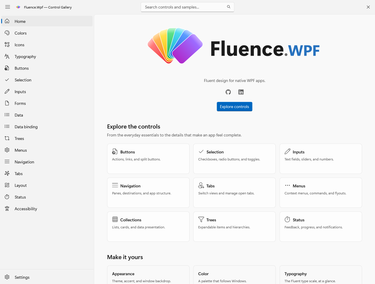
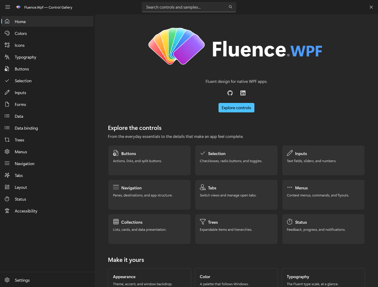
These captures demonstrate the gallery's light and dark appearance. They show the system accent in the captured environment; the controls use the shared accent resources described above.
The button samples also show themed control surfaces and accent styling:
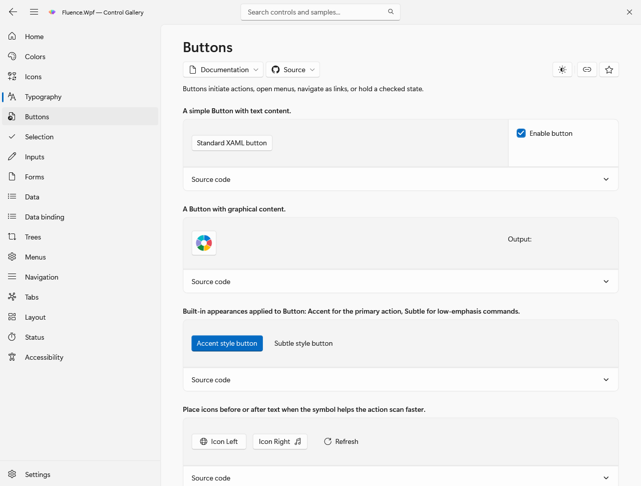
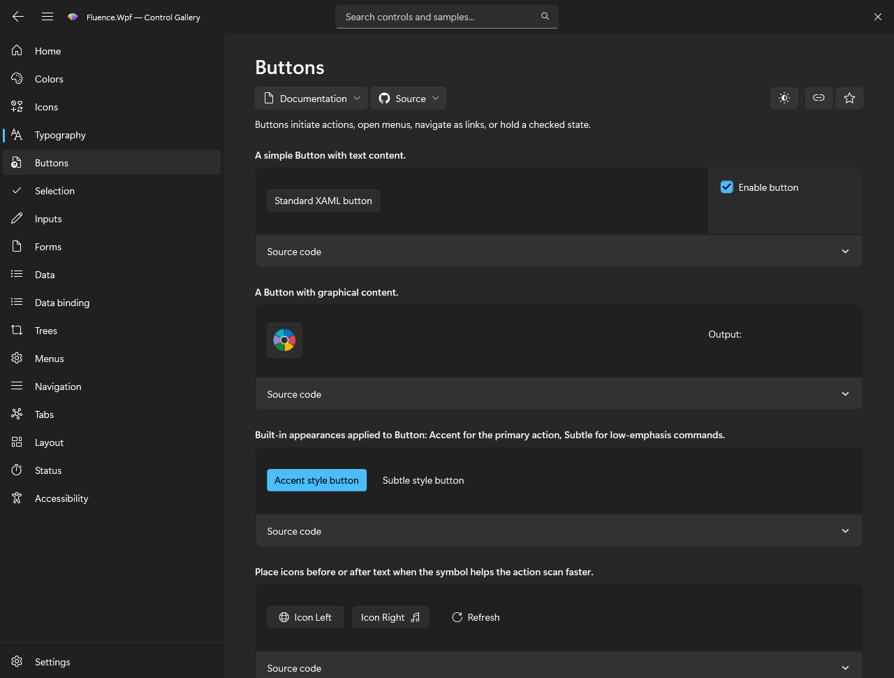
The gallery can pin a custom accent independently of the light or dark theme. These captures show the same button page with blue and orange accent ramps.
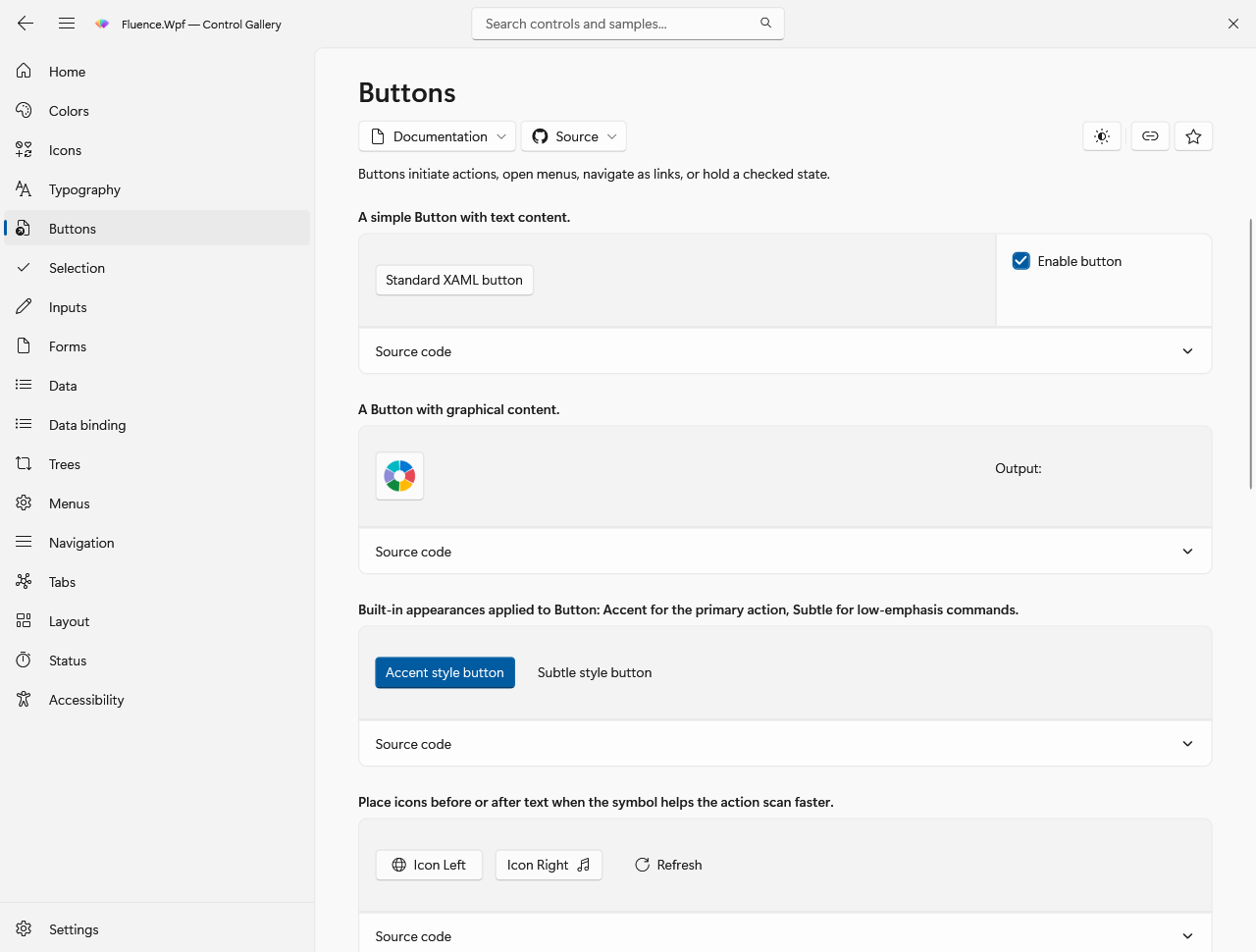
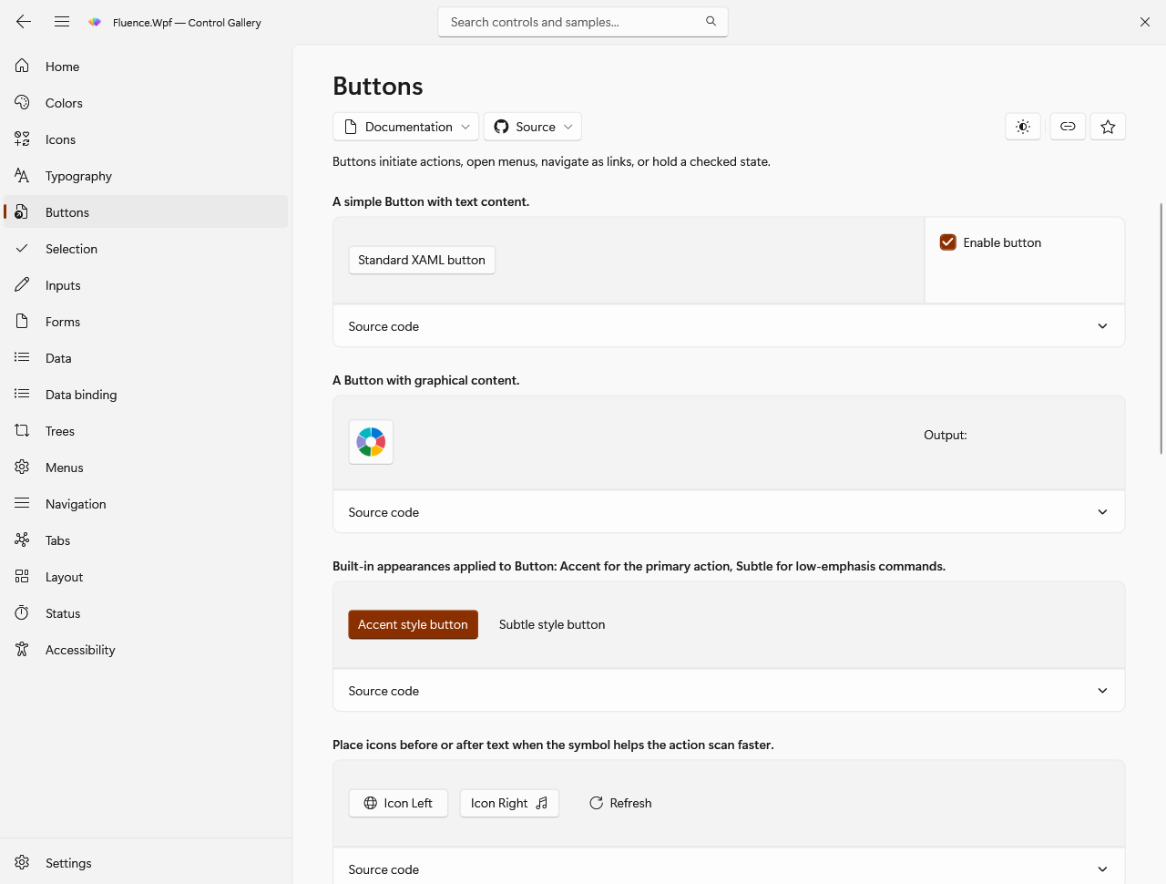
The screenshot manifest lists the captured routes and states. It records that offscreen WPF rendering omits native DWM backdrops and shadows.