Features
Fluent controls and theming for WPF applications, with a companion PowerShell module for desktop dialogs and windows.
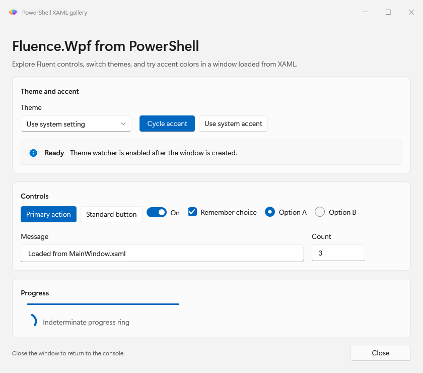
Controls and interaction states
Build with Fluent styled WPF controls for actions, forms, navigation, and feedback.
- Buttons, pickers, tabs, navigation, flyouts, and dialogs
- Hover, focus, checked, and disabled appearances
- Automation peers for supported custom controls
Themes
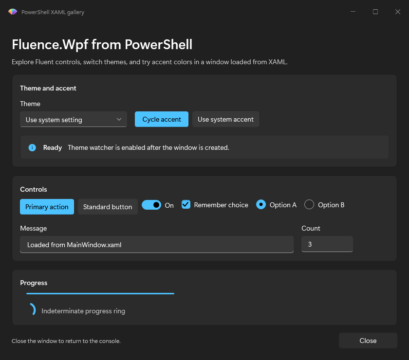
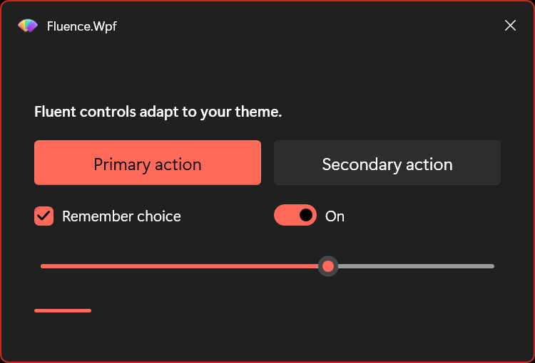
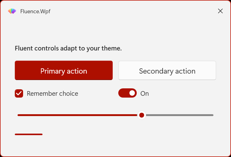
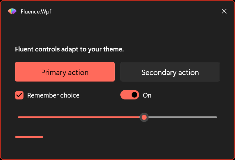
Switch the same dialog between light, dark, and high contrast appearances at runtime.
- Theme-aware brushes update at runtime
- High contrast uses live Windows system colors
- DynamicResource and ThemeResource support app-authored styles
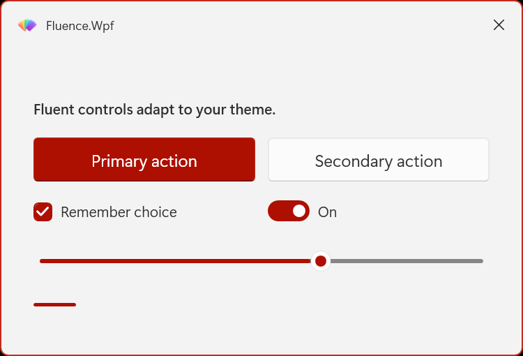
Accent colors
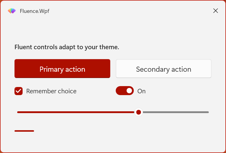
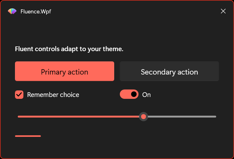
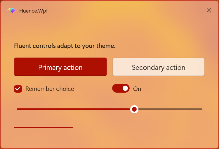
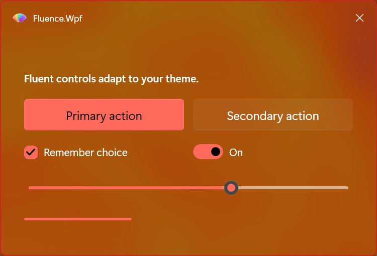
Apply a custom accent while keeping the dialog in the selected light or dark appearance.
- Red, orange, yellow, light green, dark green, dark blue, light blue, purple, and pink
- Accent-aware controls update together
- Switch back to the Windows system accent when needed
Windows and backdrops
FluenceWindow brings the title bar, caption controls, and backdrop policy into a WPF window.
- Title-area content and navigation requests
- Compare a solid window, Mica, and Acrylic
- Fallback rendering when a requested effect is unavailable
Dialogs for PowerShell
The companion module brings messages, input forms, progress, and hosted windows to scripts.
- Windows PowerShell 5.1 and PowerShell 7.4 or later
- The same light, dark, and accent experience
- Runnable examples and a command reference