Configuring a Window and Titlebar
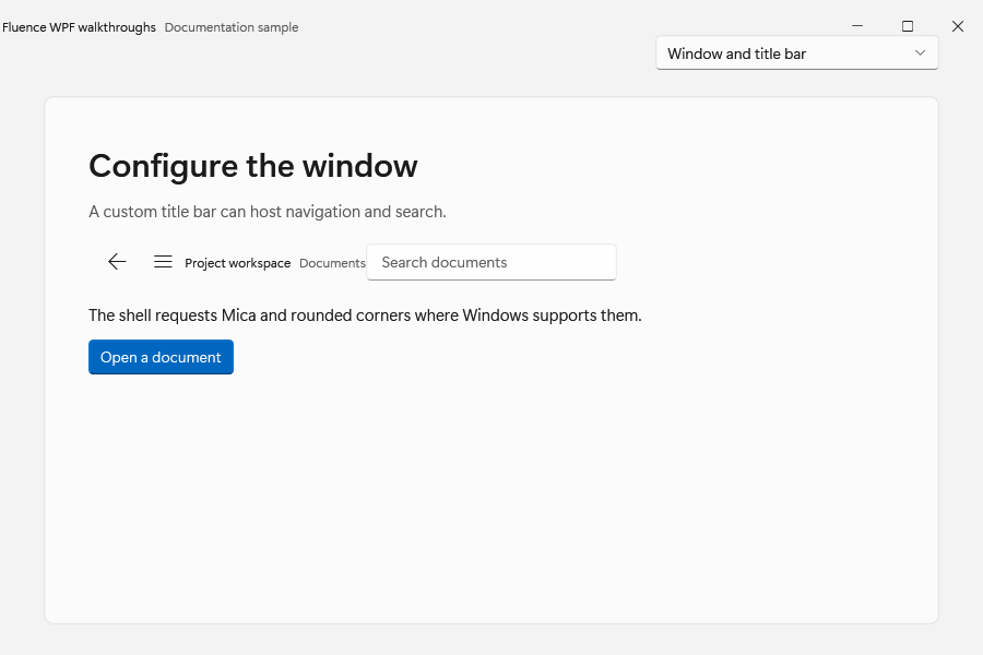
This walkthrough builds a window shell with a custom title bar, back request, pane toggle, and backdrop. Use the Basic Usage startup setup before adding the XAML below.
Use FluenceWindow when your application needs the Fluence window shell. It derives from WPF Window, so normal ownership, sizing, content, commands, and data binding remain available. Its custom chrome adds per-window backdrop and corner requests, caption controls, and a title-bar content region. See the FluenceWindow control page, TitleBar control page, and C#-only setup guide.
Add the shell
Initialize theme resources before constructing or showing windows. When creating the window from OnStartup, remove StartupUri from App.xaml to avoid WPF opening a second window. The first app tutorial shows the startup setup.
- XAML
- C#
<fluence:FluenceWindow x:Class="MyApp.MainWindow"
    xmlns="http://schemas.microsoft.com/winfx/2006/xaml/presentation"
    xmlns:x="http://schemas.microsoft.com/winfx/2006/xaml"
    xmlns:fluence="http://schemas.fluencewpf.com"
    Title="My app"
    Width="900"
    Height="640"
    Background="{DynamicResource ApplicationBackgroundBrush}"
    SystemBackdropType="Auto"
    CornerStyle="Round"
    ExtendsContentIntoTitleBar="True">
    <fluence:FluenceWindow.TitleBar>
        <fluence:TitleBar Title="My app"
            IsBackButtonVisible="True"
            IsPaneToggleButtonVisible="True"
            BackRequested="TitleBar_BackRequested"
            PaneToggleRequested="TitleBar_PaneToggleRequested">
            <fluence:TitleBar.CustomContent>
                <TextBox Width="240"
                    WindowChrome.IsHitTestVisibleInChrome="True" />
            </fluence:TitleBar.CustomContent>
        </fluence:TitleBar>
    </fluence:FluenceWindow.TitleBar>
    <fluence:NavigationView x:Name="AppNavigation">
        <fluence:NavigationView.Content>
            <Frame x:Name="MainFrame" />
        </fluence:NavigationView.Content>
    </fluence:NavigationView>
</fluence:FluenceWindow>
using System;
using System.Windows;
using Fluence.Wpf;
using Fluence.Wpf.Controls;

namespace MyApp;

public partial class MainWindow : FluenceWindow
{
    public MainWindow()
    {
        InitializeComponent();
    }

    private void TitleBar_BackRequested(object? sender, EventArgs e)
    {
        if (MainFrame.CanGoBack)
        {
            MainFrame.GoBack();
        }
    }

    private void TitleBar_PaneToggleRequested(object? sender, EventArgs e)
    {
        AppNavigation.IsPaneOpen = !AppNavigation.IsPaneOpen;
    }
}

public partial class App : Application
{
    protected override void OnStartup(StartupEventArgs e)
    {
        ApplicationThemeManager.Apply(ApplicationTheme.Light);
        base.OnStartup(e);

        MainWindow mainWindow = new();
        mainWindow.Show();
    }
}
The XAML declares MainFrame inside AppNavigation, so the handlers can use the named controls directly. If your app has no back stack or collapsible pane, omit the corresponding button and handler. The title-bar control reports requests; it does not infer your navigation model.
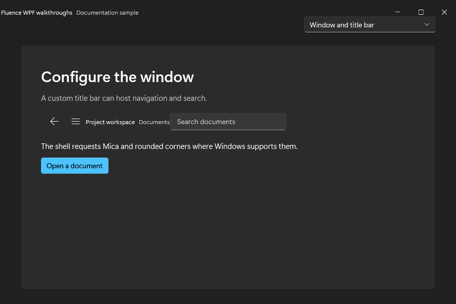
The configured window in both themes:
Choose a backdrop
Set SystemBackdropType on each FluenceWindow to Auto, Mica, Acrylic, Tabbed, or None. ApplicationThemeManager.Apply(theme, backdrop) stores the application-level request for manager consumers and change notifications; FluenceWindow does not use CurrentBackdrop as a per-window default. Set the window property explicitly for the requested effect.
The operating system may provide different results based on version, capability, and high-contrast state. Windows 11 supports DWM system backdrops where available. Windows 10 uses the library's documented fallback, and high contrast uses an opaque surface. See the compatibility guide.
Theme changes are applied to a FluenceWindow after its native window is initialized. Initialize the theme before showing the window; runtime system theme changes are watched by the window integration.
For a loaded and visible window, Light and Dark theme or accent changes fade the previous WPF surface out over 167 ms. The new resources and public events are applied immediately beneath that short transition. High Contrast entry and exit remain immediate. The fade is skipped when motion is disabled or the window cannot be captured; ordinary WPF Window instances have no overlay. Native DWM backdrop pixels do not interpolate with the WPF content.
Caption controls
IsMinimizeButtonVisible, IsMaximizeButtonVisible, and IsCloseButtonVisible use WPF Visibility values and default to Visible. The related IsMinimizable, IsMaximizable, and IsClosable flags default to true and control whether each action is allowed. ResizeMode also constrains resizing and maximize behavior. CornerStyle requests a corner preference; Windows may ignore it where unsupported.
For a regular WPF Window, Fluence controls can still be used after theme initialization. The DWM shell, custom caption controls, and title-bar behavior belong to FluenceWindow.