Creating controls programmatically
This walkthrough builds the same simple window shape as Basic Usage directly in C#. It uses dynamic resource references so controls created in code also respond to theme changes.
Fluence controls can be created directly in C#, bound to a view model, or declared in XAML with C# event handlers. Initialize the application theme before constructing the visual tree, as shown in the first WPF app tutorial.
The C# API reference lists each type's constructors, properties, methods, events, and related types. The control catalog provides usage examples and screenshots.
Choose the correct control namespace
Many Fluence controls share a name with a WPF control. Use an alias when your file needs both libraries:
using System.Windows;
using Fluence.Wpf;
using Controls = Fluence.Wpf.Controls;
Controls.Button is the Fluence button. System.Windows.Controls.Button is the framework button. Check the inheritance declaration on each API page: some Fluence types extend the corresponding WPF control, while others have a different base type and their own properties.
Build a window without XAML
This MainWindow constructs its content in C#. Use it with the application's OnStartup from the first app tutorial. For this version, remove the template's MainWindow.xaml and replace its code-behind with MainWindow.cs below. Do not call InitializeComponent; the constructor creates the visual tree.
using System.Windows;
using Fluence.Wpf;
using Controls = Fluence.Wpf.Controls;

namespace MyApp
{
    public sealed class MainWindow : Controls.FluenceWindow
    {
        public MainWindow()
        {
            Title = "My Fluent application";
            Width = 640;
            Height = 400;
            SystemBackdropType = WindowBackdropType.Auto;
            ExtendsContentIntoTitleBar = true;
            TitleBar = new Controls.TitleBar { Title = Title };
            SetResourceReference(BackgroundProperty, "ApplicationBackgroundBrush");

            Controls.TextBlock status = new() { Text = "Ready to continue." };
            Controls.Button button = new()
            {
                Content = "Continue",
                Appearance = ControlAppearance.Accent,
                HorizontalAlignment = HorizontalAlignment.Left,
            };
            button.Click += (_, _) => status.Text = "The button was clicked.";

            Controls.StackPanel panel = new()
            {
                Margin = new Thickness(24),
                Spacing = 16,
            };
            panel.Children.Add(status);
            panel.Children.Add(button);
            Content = panel;
        }
    }
}
The button inherits WPF's Click event and command support. Appearance is a Fluence property. The stack panel's Spacing property adds space between children. See FluenceWindow, Button, and StackPanel for their visual examples.
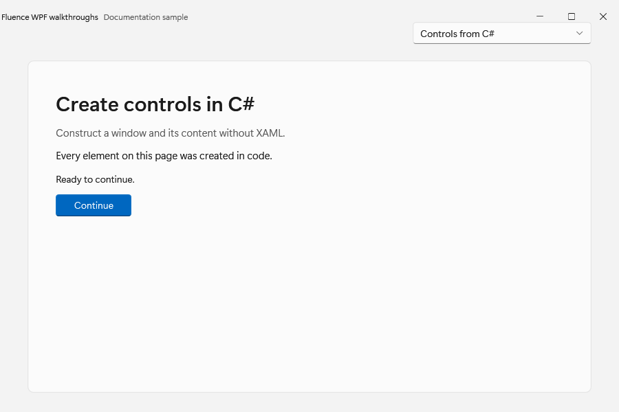
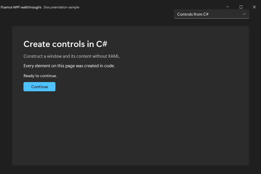
The code-created window in both themes:
Bind a dependency property
Use WPF bindings with Fluence dependency properties. For example, this text box reads and updates a DisplayName property on its inherited DataContext:
Controls.TextBox nameInput = new()
{
    PlaceholderText = "Display name",
};
nameInput.SetBinding(
    Controls.TextBox.TextProperty,
    new System.Windows.Data.Binding("DisplayName")
    {
        Mode = System.Windows.Data.BindingMode.TwoWay,
        UpdateSourceTrigger = System.Windows.Data.UpdateSourceTrigger.PropertyChanged,
    });
Set the window or container's DataContext to your view model. Implement INotifyPropertyChanged on that view model when changes made in code must update the UI. Use ICommand bindings for actions in an MVVM application; the MVVM sample shows a complete application.
Keep resource references responsive to theme changes
SetResourceReference is the C# counterpart of a XAML DynamicResource reference. It lets WPF resolve a new brush after a theme or accent change:
Controls.Border surface = new();
surface.SetResourceReference(
    Controls.Border.BackgroundProperty,
    "CardBackgroundFillColorDefaultBrush");
Assigning a brush fetched once from FindResource stores that brush instance. It does not establish a dynamic resource reference. Prefer SetResourceReference for theme-dependent values and use the published keys in the theme resource reference.
Apply attached properties to native controls
Some features extend an existing WPF type instead of introducing a new control. PasswordBox is sealed, so Fluence exposes its additions through PasswordBoxExtensions:
System.Windows.Controls.PasswordBox password = new();
Controls.PasswordBoxExtensions.SetPlaceholderText(password, "Enter your password");
Controls.PasswordBoxExtensions.SetShowCapsLockIndicator(password, true);
The generated PasswordBoxExtensions API documents the attached-property getters, setters, and dependency-property identifiers.
Update controls on their UI dispatcher
Construct and update WPF controls on the UI thread. When background work finishes, marshal the update to the dispatcher that owns the control:
await status.Dispatcher.InvokeAsync(() =>
{
    status.Text = "Finished.";
});
Here status is the text block being updated. Keep long-running work out of event handlers on the UI thread. For modal asynchronous UI, use ContentDialog and await its result from a UI event handler.
Read the API reference
- A type's declaration shows its namespace, base type, and implemented interfaces.
- Properties describe the value you set or read. Dependency-property fields expose the identifiers used for binding, resource references, and metadata.
- Overloads have separate signatures and parameter descriptions. Use the signature that matches your arguments.
- Protected members are extension points for derived classes, not methods to call on a control instance from application code.
- Inherited WPF members remain available even when a reference page focuses on members declared by Fluence.
Start with the API index or return to the control catalog.