Add Navigation and tabs
Build a two-destination shell and place tabbed content on one destination. The Basic Usage window provides the theme startup and title bar.
Use NavigationView for the application's main destinations and TabView for documents or parallel workspaces. Both are normal WPF controls with Fluence templates.
Host page content in NavigationView
NavigationView derives from Selector. Put destination items in its item collection and place the active page in its Content property. A bare Frame child would be treated as an item, so use the property element:
<fluence:NavigationView xmlns="http://schemas.microsoft.com/winfx/2006/xaml/presentation"
                        xmlns:x="http://schemas.microsoft.com/winfx/2006/xaml"
                        xmlns:fluence="http://schemas.fluencewpf.com"
                        PaneDisplayMode="Left"
                        IsPaneOpen="True"
                        ItemInvoked="OnItemInvoked">
    <fluence:NavigationViewItem Content="Home" Tag="home" />
    <fluence:NavigationViewItem Content="Settings" Tag="settings" />
    <fluence:NavigationView.Content>
        <Frame x:Name="PageFrame" NavigationUIVisibility="Hidden" />
    </fluence:NavigationView.Content>
</fluence:NavigationView>
Handle ItemInvoked to navigate the content frame. The event fires before selection changes. BackRequested is separate from selection, and the application owns its navigation history. The gallery shell shows a complete implementation, including pinned footer items and a title-bar search box.
PaneDisplayMode selects left or top navigation. IsPaneOpen controls expansion in left modes. FooterMenuItems holds destinations pinned below the scrolling menu.
Add closable tabs
TabView extends WPF TabControl; use TabViewItem for each tab. TabCloseRequested reports a close request, so your application decides whether to remove the item or ask the user to save work. AddTabButtonClick reports the optional add button, and IsAddTabButtonVisible controls its display.
<fluence:TabView xmlns="http://schemas.microsoft.com/winfx/2006/xaml/presentation"
                 xmlns:fluence="http://schemas.fluencewpf.com"
                 IsAddTabButtonVisible="True"
                 AddTabButtonClick="OnAddTab"
                 TabCloseRequested="OnTabCloseRequested">
    <fluence:TabViewItem Header="Overview">
        <TextBlock Text="Overview content" />
    </fluence:TabViewItem>
</fluence:TabView>
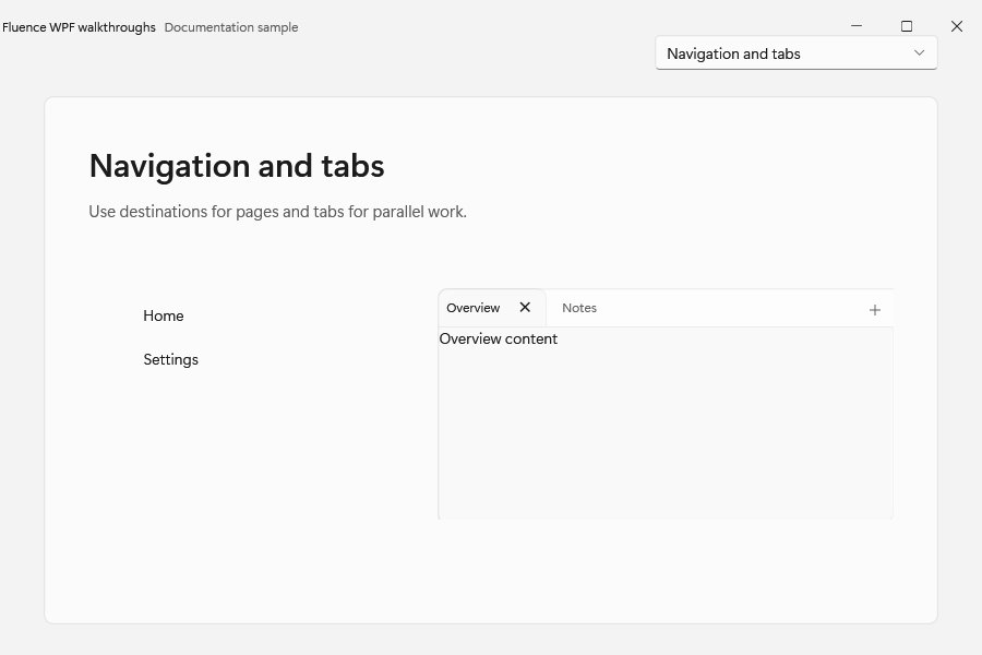
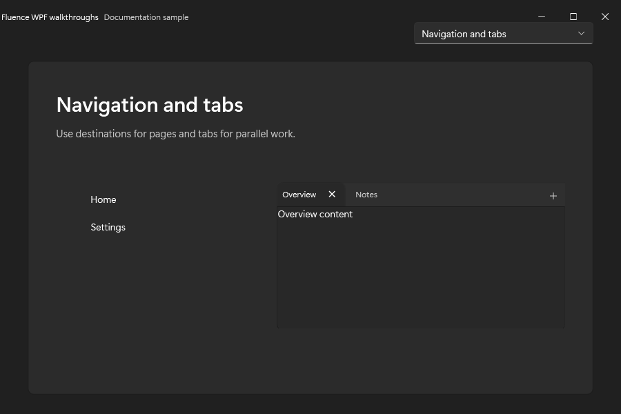
The navigation shell and tabs in both themes:
See the tab gallery page for data-bound and closeable examples. The control catalog covers adjacent navigation controls such as BreadcrumbBar, PipsPager, and SelectorBar.